Book cover and Editorial design.
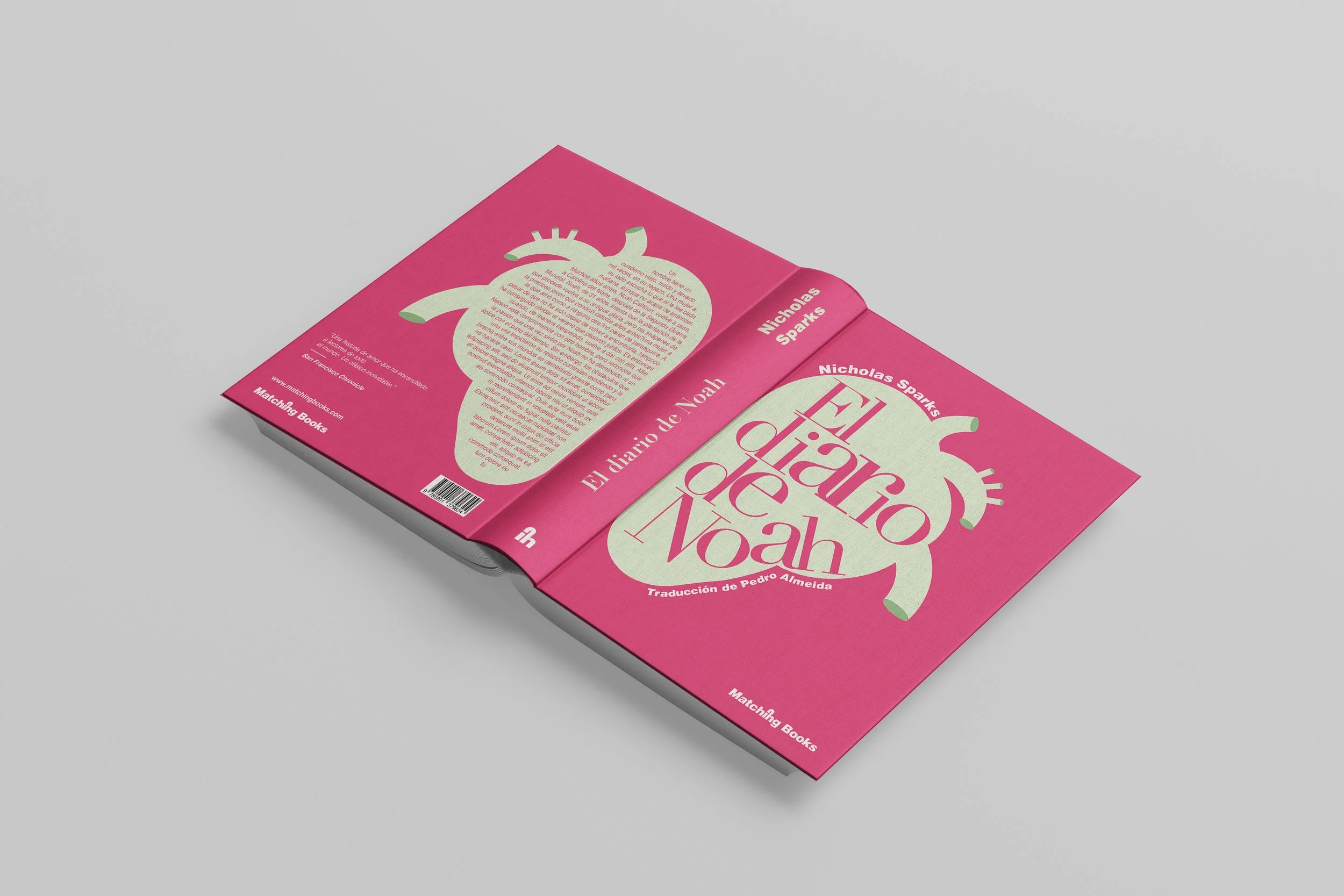
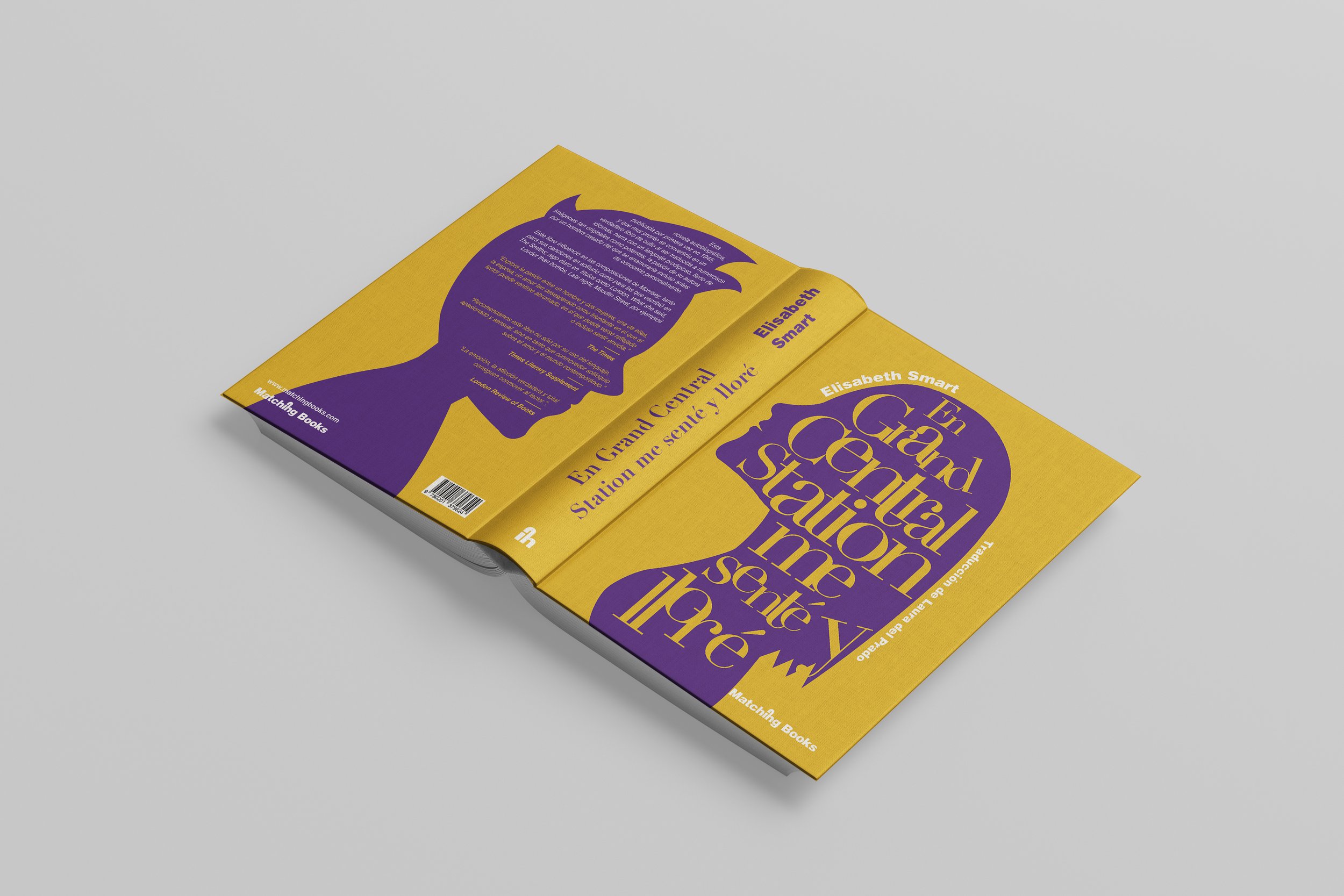
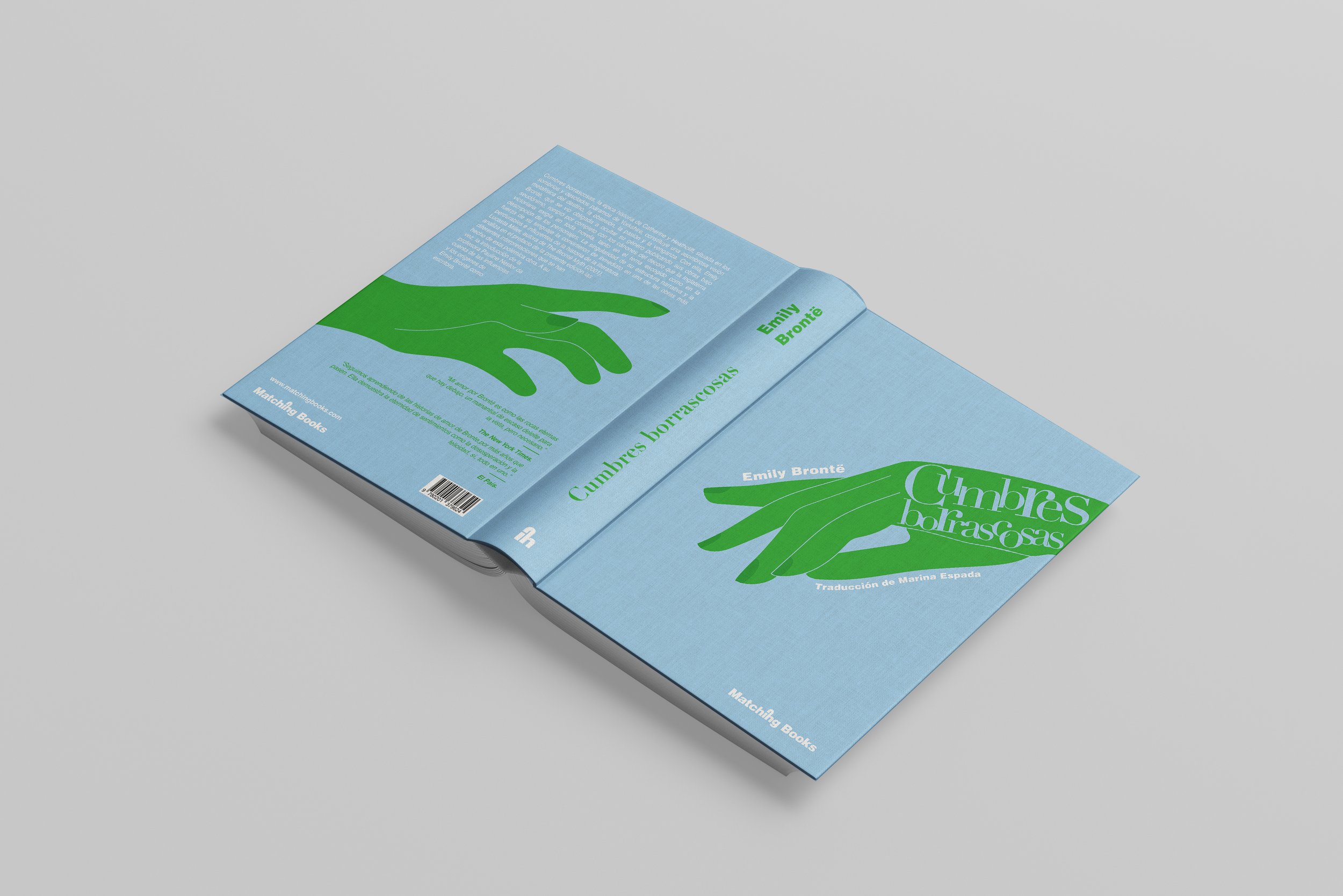
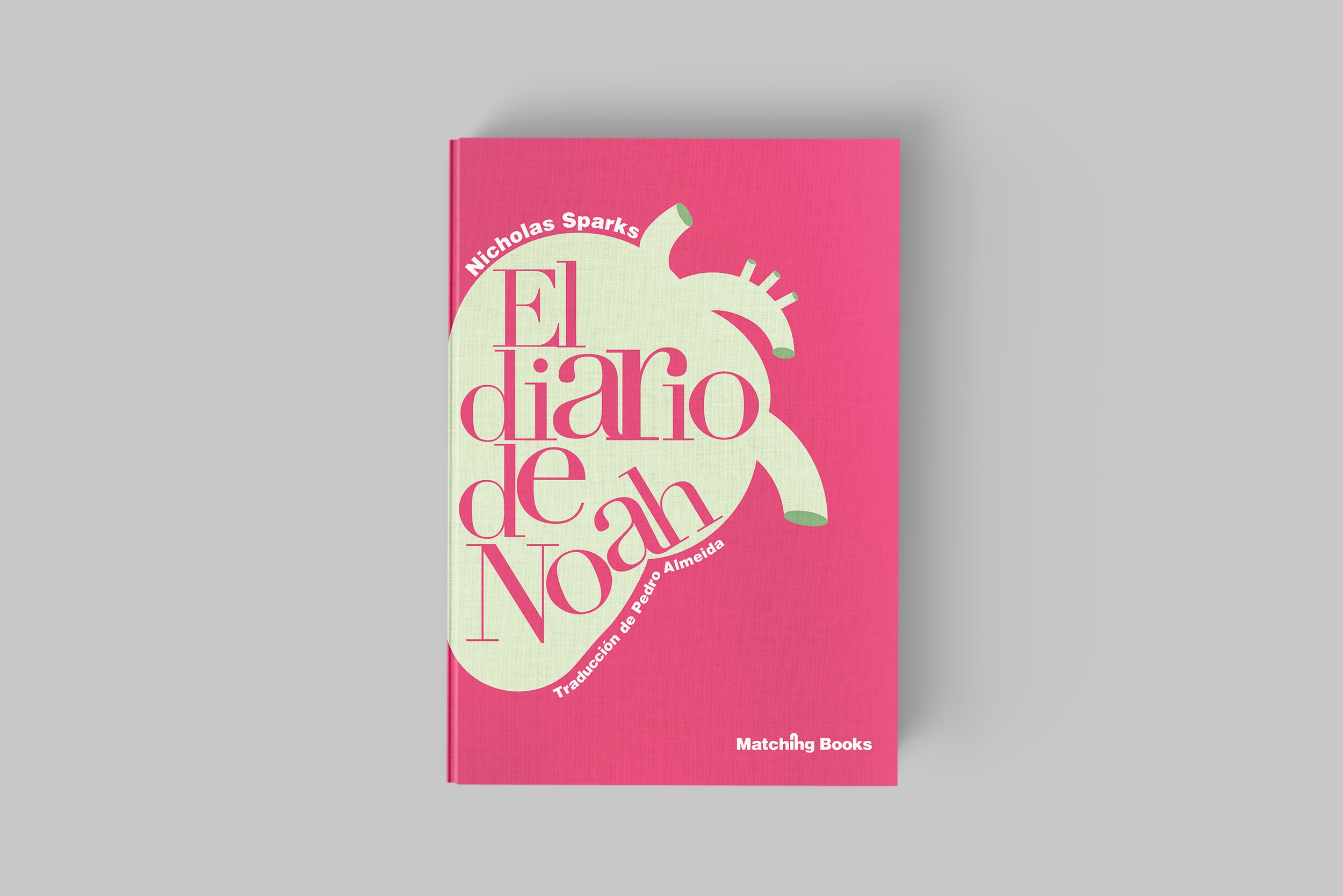
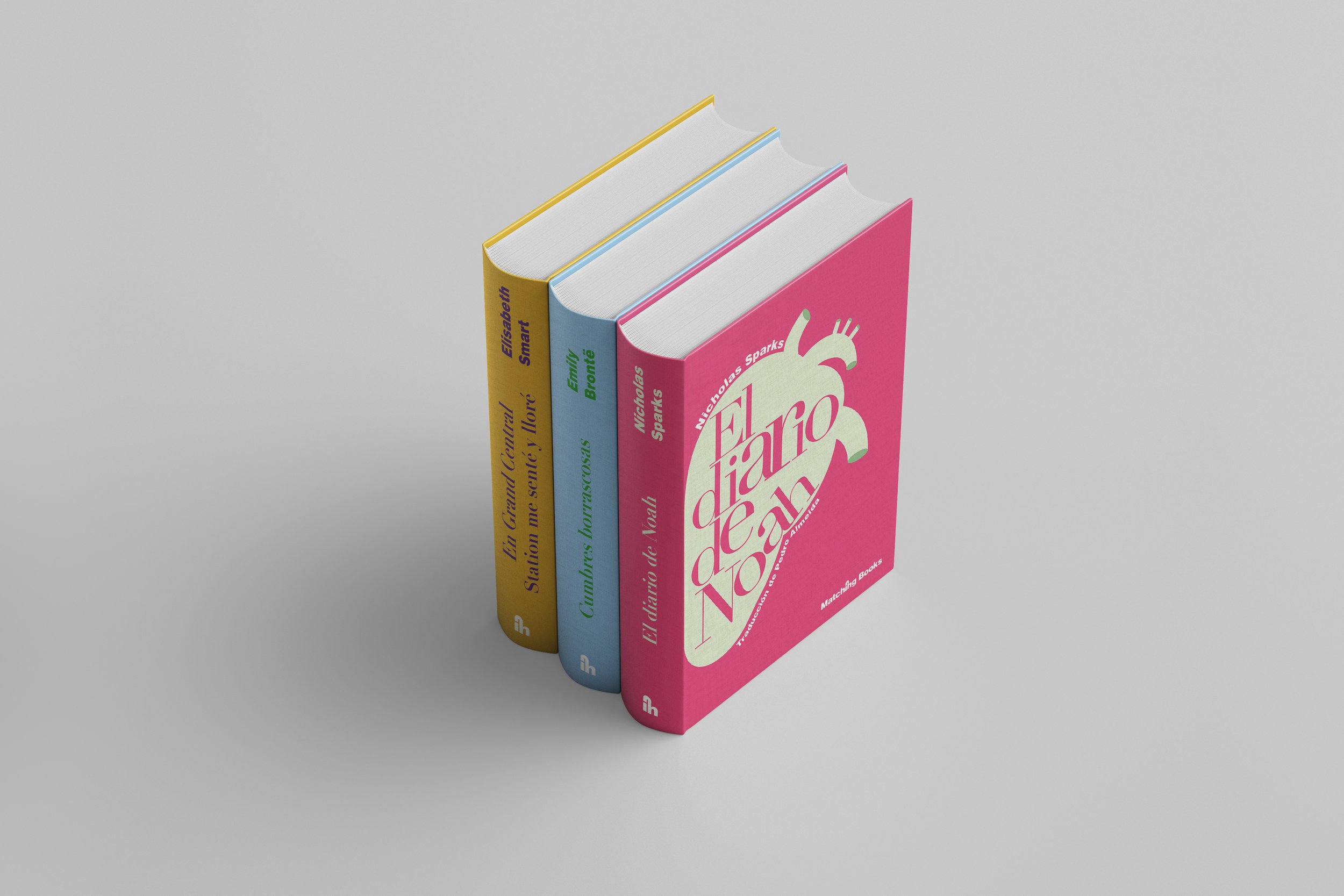
Take a look at a captivating editorial design project: a logo and book cover collection for Matching Books. The logo itself captures the essence of the brand through typography, while the three book covers feature stunning illustrations that visually narrate the stories within. When the front and back covers are brought together, they form a complete image, such as a heart or a couple, symbolizing the depth and connection found within the pages. With a striking contrast between colors and typography, this design project exudes a sense of intrigue and visual impact.
A captivating name for a romance book publisher that emphasizes the power of connections. The name "Matching Books" cleverly signifies the love unions found within the pages of the romantic stories of the books. It embodies the idea of bringing together characters, themes, and emotions that resonate with readers, creating a memorable reading experience.
The fonts used were Didot Regular for cover titles and Helvetica Black for the logo and body text.